Typography that moves to the beat of Rio Carnival
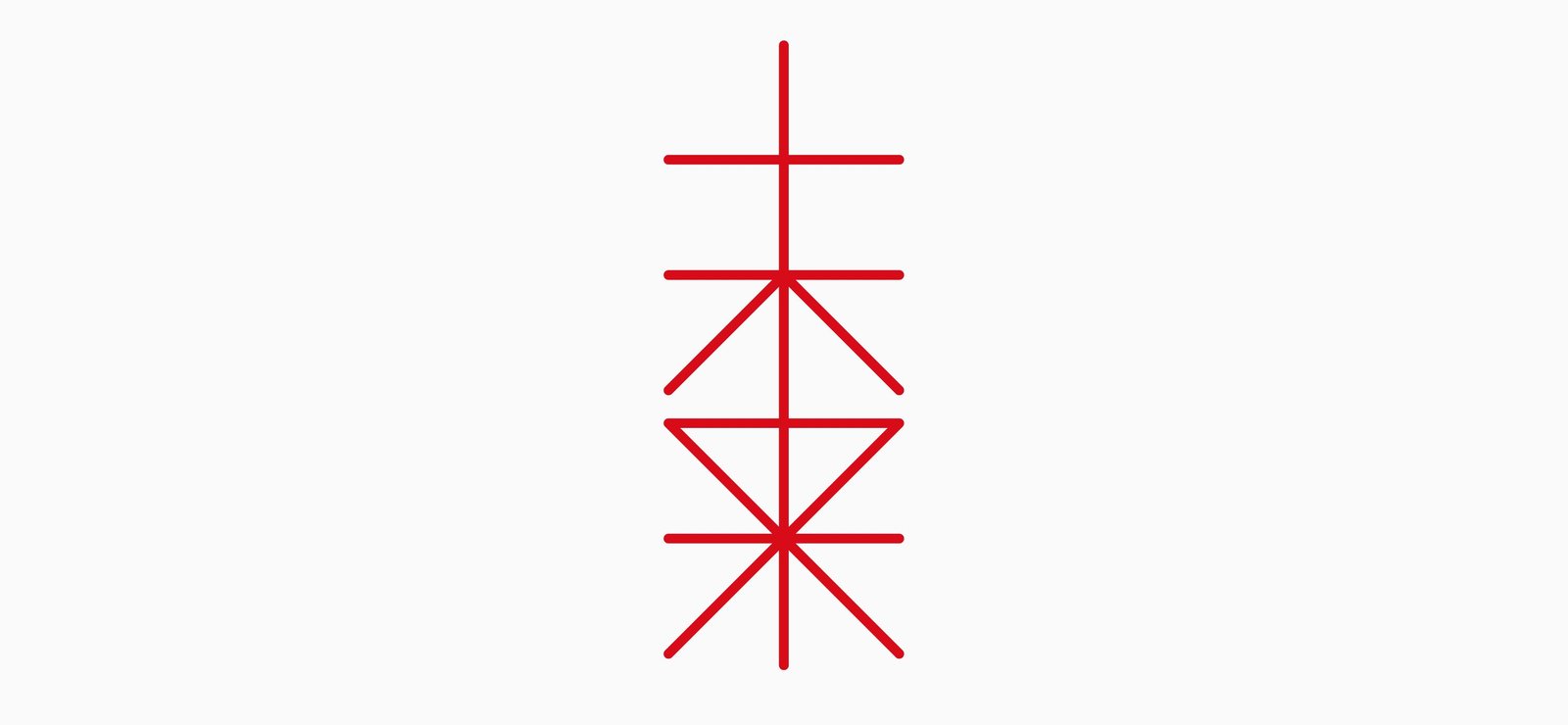
The Rio Carnival brand represents the samba community, the power of the collective, the infectious energy of Rio de Janeiro and the music and history of its culture. Tátil Design partnered with Plau Design to create a new visual identity for the event with years of rich history, drawing inspiration from the lively spirit of the city and its Samba schools. Using custom software developed specially for this project, the typography reacts to the sound of instruments, adapting colours and motion in time with the beat.
Authentic cultural representation
The team at Tátil realised that they had to start with some deep research. Art Director Alice Gelli describes feeling “a big responsibility to represent the culture” and interviewed 15 Samba personalities in-depth to get a big picture view. The team then broadened the research with over 7,000 online questionnaire responses before realising the flag must be the central motif. CEO of Tàtil Fred Gelli tells us that while it may seem an “obvious” conclusion, the most important part of the identity was that it felt authentic and informed by the Samba community. The flag icon then formed the seed for the whole project.

Creating living typography that moves
The flags at Rio Carnival are always in movement and so the team knew the typography couldn’t be static. CEO of Plau Design Rodrigo Saiani describes employing “variable brand voice” to think of type in terms of animation by using key frames. The type design is then coded to respond in real time to sounds around it and move in rhythm. When viewing the logo on a computer, the letters burst into colour and life as the mouse passes through the type.

Trust the process
Saiani describes releasing the new identity as “nerve-wracking” because the concept would feel very new while the Carnival was a long-held tradition, but says that Tàtil was instrumental in advising everyone to trust the process. A formative moment took place when early still images that had been leaked received some criticism on social media. He describes the joy of seeing Twitter “turned upside down from hate to love” when the final identity was released in its full glory of colour and movement.


