back to annual
YouTube Video

The resource helping entrepreneurs of colour bloom

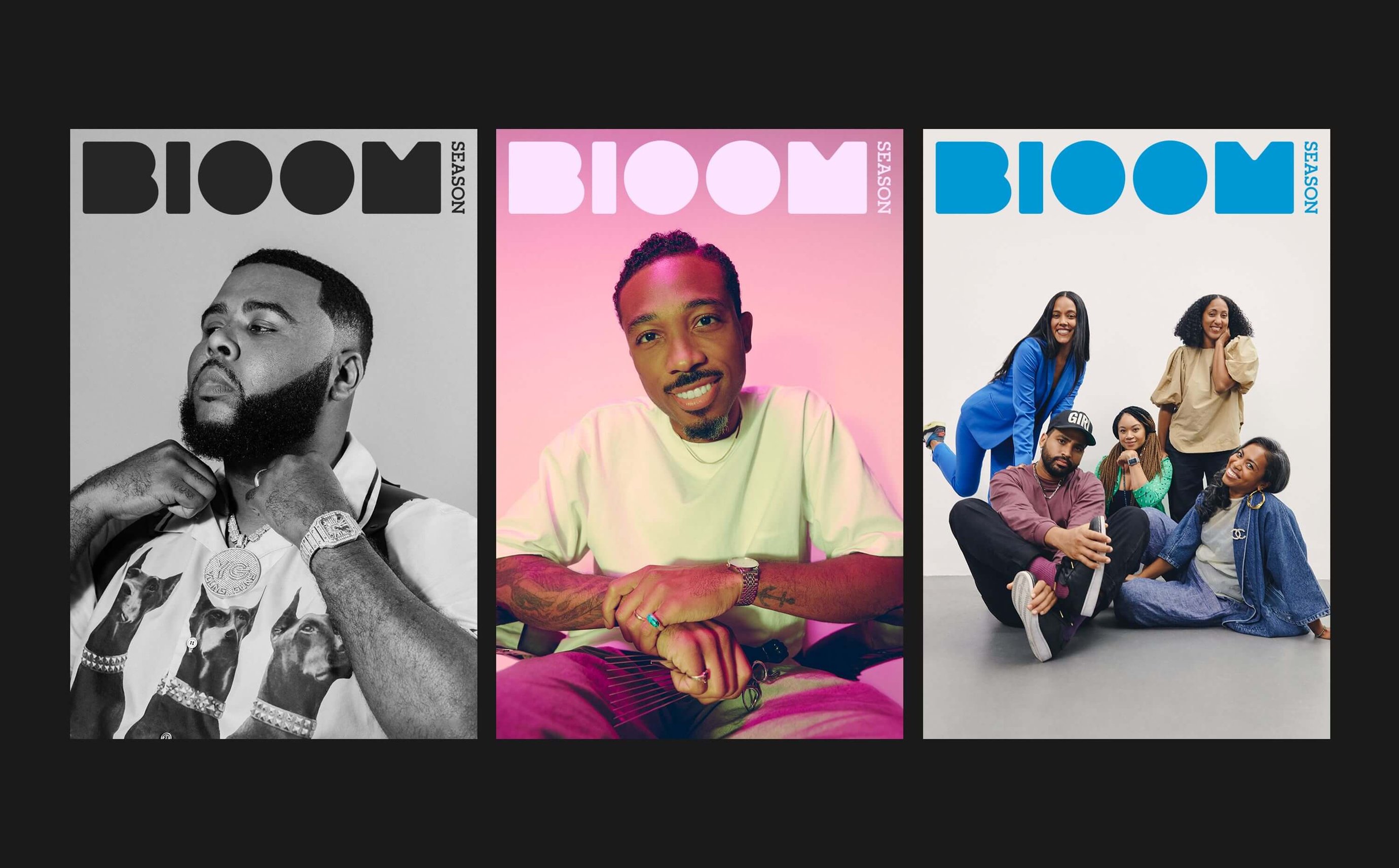
Bloom Season by Kin for Mailchimp is an online resource stacked full of first-hand experiences and actionable insights to help entrepreneurs of colour to thrive. The platform creates a space for conversations on family, social justice, wellness and business, and rewrites the traditional playbook for business success by addressing the needs of Black entrepreneurs. The inaugural issue focused on the specific challenges that Black entrepreneurs face while capturing their experiences in a positive light, working with writers, designers, photographers, and filmmakers from the community.

Understanding the experience of entrepreneurs of colour

The minds behind Bloom Season wanted to build a resource that was utilitarian, well-informed and actionable. Founder of Kin Kwame Taylor-Hayford tells us that it was “important that we put it in the hands of entrepreneurs who would actually use this content.” The team at Kin got direct insights by speaking to eight Black entrepreneurs and discovering that key challenges were isolation, stress, and a sense of alienation. Based on this research, the project was designed to rebuild trust and move away from performative commitments.

illustrated poster with two people of colour promoting 'therapy for black entrepreneurs'
Bloom Season, Kin

Bringing lived experience into the art direction

Kwame tells us that as well as being “an immaculate designer”, Design Director Chris Cyran is of the community and was able to bring a lot to the process from a lived perspective. The bold colour palette, for example, was a deliberate choice to make the site “be about empowerment, to feel uplifting, to be a celebration”.

illustrated poster with four people of colour in front of large plant
Bloom Season, Kin

Answering a gap in the market

Kin looked at the established platforms and didn’t find anything that spoke to the unique experiences of entrepreneurs of colour “from their perspective, by people who are of the community.” This gave the team the opportunity to answer that gap in the market and build something unique. The site was met with acclaim from entrepreneurs of colour feeling proud to be accurately represented. With a second edition launching next year, stay tuned for an even “bigger and better expression” of Bloom Season.

Explore Digital Design

Minna Bank thrashes tradition with a modern and monochromatic design for a younger generation

Minna Bank thrashes tradition with a modern and monochromatic design for a younger generation

Banking has remained more or less unchanged in Japan for 150 years, and refreshing heritage brands to appeal to a younger audience is no mean feat. There’s much to consider when taking something that’s typically brick and mortar digital: security, trust, and a user-friendly interface being just a few examples. But in the case of Minna Bank, there was no hurdle too big as a team of designers, illustrators and directors created Japan’s first digital bank. To mirror the values of a younger generation and make financial technology appeal to them, the team used simple line illustrations, a black-and-white colour palette and stylish iconography – winning a Graphite Pencil in Branding and being shortlisted for both the Illustration and Digital Design categories. Here, Fjord Tokyo Design Director Taehan Yoo, Head of Design at Minna Bank Takatoshi Nakamura and Illustrator Hiroaki Seto tell us about their process, the importance of target audience research, and the risks needed to take on a branding project like this.

Capturing the vibe of a generation in design

Minna Bank is pioneering in its ability to adapt to the new. As Japan’s first digital bank it’s given the traditional banking model a modern twist by introducing a cloud server that’s easy to update – an appealing aspect for the digital generation that didn’t exist previously in banking services. “In order to create a bank of the future, it was necessary to give a feeling that a completely new thing was born while respecting the accumulation so far,” says Taehan Yoo, Creative and Design Director at Fjord Tokyo. “There was a big divide between the younger generation and the banking industry, and we wanted to bridge that gap with the power of creativity by breaking away from the traditional bank-likeness. Many of the younger generation today live in a more free environment, and I wanted to express that atmosphere with the bank.”

monochrome illustrated figures with Minna logo
Minna Bank, Fjord Tokyo & Minna Bank

Colour palettes can be used to gain trust

Colour has the power to make or break a project. In the case of Minna Bank, the team opted for a monochromatic palette in order to convey a sense of confidence, stability and security, as well as appeal to a younger audience. “Confidence is indispensable for the expression of banks,” says Takatoshi Nakamura, Head of Design at Minna Bank. Starting off with a deep-dive into the life and culture of the target group – i.e. teens, and those in their 20s and early 30s – the team discovered how the current banking approach uses language that’s “difficult to understand”, says Nakamura. In response, the research reported that simplicity and monochrome was the right path to take. “In the Japanese banking industry, green, red and blue were the mainstream,” adds Taehan Yoo, “and monochrome expressions were rarely adopted. It was a strategy that was logically established by observing these environments.”

monochrome illustrated figures with Apple Wallet card
Minna Bank, Fjord Tokyo & Minna Bank

Foster relatability by factoring fashion and taste into illustrations

In order to appeal to the younger generation, a vital component was the inclusion of illustration. “Colouring and typography are important elements that visually compose the brand,” says Taehan Yoo, “but the illustrations are what reach the user most directly, and they really seemed to be game changing.” Working with Illustrator Hiroaki Seto, the team were able to develop a visual language that both gave a sense of inclusion and diversity in the illustrations, plus a feeling of “casualness and sincerity,” says Takatoshi Nakamura. 

With their specific audience in mind (the digital-native generation) the Minna Bank team made sure to gather as much information about their preferences, taste and needs in order to proceed with the illustrations. This was particularly useful in the character development, which included research into the various body shapes in the world, as well as the types of clothes that the younger generation wears. “I looked at casual clothes such as Muji and Uniqlo, which are familiar to me, but I also looked at the clothes of fashionable people not only in Japan but around the world,” says Hiroaki Seto. “You can spot the clothes of people walking in NY and London that appear in the content that introduces cities around the world on Youtube; t-shirts with little information and simple fashionable jeans. I thought that life-size fashion could be produced because it was casual and simple.”

various mobile phone screenshots with monochrome illustrated figures
Minna Bank, Fjord Tokyo & Minna Bank

Stand out in your category by doing what nobody else will

Why play it safe and design an identity that looks like everything else in the market? Minna Bank went against the grain when it came to its own brand, and the team couldn’t be more delighted with the monochromatic outcome. The illustrations and bold colour palette certainly paid off, too, despite a few doubts during the process. “To be honest,” says Taehan Yoo, “I was thrilled with the monochrome. The design team was confident and prepared, but there were not zero voices asking if it would really succeed. Yellow, which is associated with money, is used as a sub-colour, but it is also set to a modern, high-tone yellow instead of the old-fashioned yellow, and yellow is used as a functional element unlike the brand colour. So, I wondered if this thorough monochrome expression really worked or was too new, and there were nights when I couldn't sleep (laughs).”

Explore Illustration

We have placed cookies on your computer to help make this website better.
You can change your cookie settings at any time. Otherwise, we'll assume you're OK to continue.