back to annual
YouTube Video

From bread to breasts – the taboo-busting PSA

Traditional customs dictate that Lebanese women rarely talk openly about their bodies. However, this respect for tradition presented a different opportunity to encourage conversation, by drawing on one of the oldest customs in the world: baking bread. The Bread Exam is a recipe video in which Lebanese baker, Um Ali, demonstrates the steps of a breast self-exam through a similar gesture: the act of kneading and pressing dough. The gestures are shown without a single mention of breasts, transforming an intimate subject into an acceptable, everyday experience.

Executing the creative brief

Storyteller and filmmaker Danielle Rizkallah took the initial concept from McCann Paris and developed it into a film. She decided to shoot in the mountains in Lebanon, in a home that resembled the comfortable kitchen Um Ali would usually work in. To inform her performance, Um Ali was taken to three different gynaecologists to learn the movements to make using the dough.

hands kneading two balls of dough
The Bread Exam, McCann Health & McCann Paris

Casting for authenticity

Rizkallah explains, “We needed someone authentic, super believable, transparent in her face, someone… who doesn’t act anything in her life.” Um Ali was a clear favourite for the casting team, as they knew she would deliver the message with the conviction it needed while garnering absolute trust. Casting someone traditional with modern values was decisive in landing the message and ensuring women and the men in their lives would accept the advice in the film.

hands kneading two balls of dough
The Bread Exam, McCann Health & McCann Paris

Using creativity to overcome cultural taboos

In much of the world, feminine health is associated with some kind of taboo and Rizkallah says that people in Lebanon will often switch channels when adverts for sanitary products come on. Using the age-old trusted process of bread-making was the vehicle in which the life-saving taboo advice could be delivered. Rizkallah explains that it is up to creatives to find new ways to make sure these messages are heard, “Creative ideas do work and do reach people. We need to be the good shepherds.”

Explore Impact

How Apple’s accessible library of symbols scooped a Yellow Pencil for Type Design

How Apple’s accessible library of symbols scooped a Yellow Pencil for Type Design

In 2019 Apple released SF Symbols and web developers rejoiced over the free dictionary of more than 1,000 elegant, highly configurable symbols for easy and flexible incorporation into the app design process. 

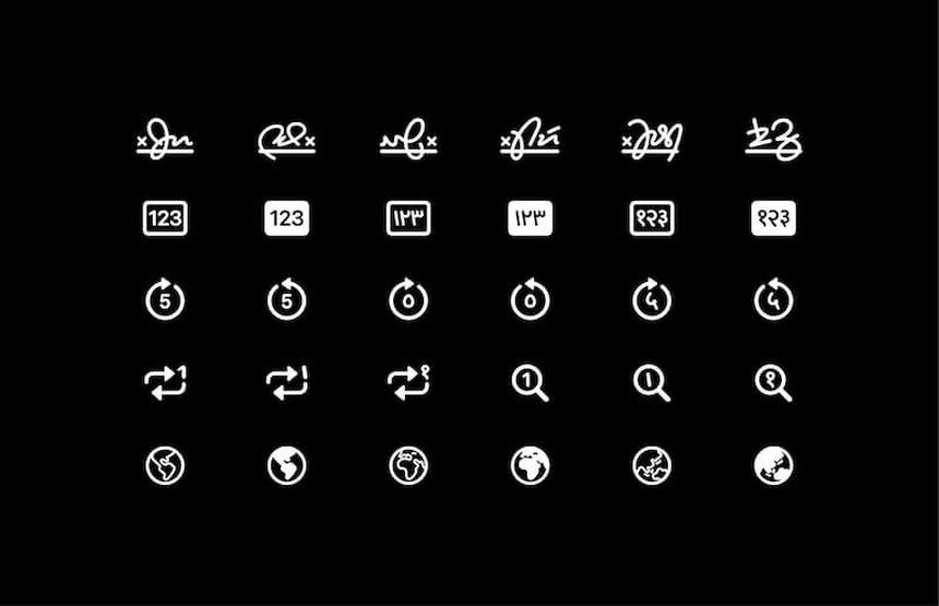
In September 2021 the Apple design team instilled further delight when they unveiled the new and improved SF Symbols 3.0, winner of 2022’s only Yellow Pencil for Type Design. This included the addition of over 600 new symbols to the library with an increased focus on accessibility, thanks to a series of localised variants spanning eight different scripts. It also offered users greater control over colour application, courtesy of freshly incorporated rendering modes, and access to an updated version of the SF Symbols app, including a new inspector, image export opinions, and improved custom symbol support.

Here, in a rare interview, the design team sheds light on how they created symbols that operate in perfect harmony with fonts.

grid of blue and white icons
SF Symbols 3, Apple Design Team

Type and symbol design were approached in much the same way

The Apple design team created SF Symbols 3 as an extension of the San Francisco font. “Both type and symbols are systems fundamental to communication. Letters are combined to make words, and symbols into interfaces,” say the design team of this decision. “While each system is unique and can be used in isolation, type and symbols frequently coexist in the same context, so we think of type and symbols as two parts of a cohesive system.”

As such, many of the characteristics of San Francisco are detectable in the SF Symbols’ design, including the weight and stroke contrast. Moreover, one of the great innovations of SF Symbols is that they are drawn using the same tools and techniques the designers use to create the type, which means they were able to “more precisely control the relationship between the two”.

The design was kept consistent

The need to conjure harmonious synergy between type and symbols stems from the team’s overarching goal of rendering distinct, easy-to-read interfaces, consistently across all Apple platforms, while offering external designers and developers as much freedom as possible. “Our interfaces are dynamic and customisable: the size of text can be adjusted to suit an individual’s preferences and needs,” they explain. “Designing symbols as an extension of our system font has allowed us to scale symbols with text while preserving the relationship between the two.” They also wanted to ensure greater continuity between Apple’s hardware and software. “In the same way that San Francisco is applied consistently across our products, SF Symbols features a singular, recognisable design language that is shared among our interfaces, both physical and digital.”

grid of white icons
SF Symbols 3, Apple Design Team

But simplicity and distinctiveness are of equal importance

The best-designed symbols are the simplest form of communication, which means classifying and organising the information they convey is a vital part of the design process. “We seek to reduce the concepts and forms to their essence, including only what is necessary to communicate an idea, and ensure legibility even at small sizes,” say the team. Thus, while rigorous consistency is a top priority, so too is what they term ‘radical diversity’. “Symbols must have intentional and shared relationships with one another so that any combination can be used together in the same context. But they must also be distinctly recognisable and easily differentiated.”

With colour comes expression

One of the most exciting aspects of SF Symbols 3 is the introduction of new rendering modes to better support colour application, customisation and shading – allowing for more expressive iconography across the board. “Symbols began as single colour forms, similar to text. But colour plays a significant role in how symbols convey a concept, state or function and this often requires that more than one colour be applied to a symbol’s individual elements,” say the designers.

For SF Symbols 3, they needed a way of implementing colour consistently across the entire library – something they achieved through layer annotation, which assigns properties to each shape within a symbol that control how colour is applied in different rendering modes. In the case of SF Symbols 3, these include hierarchical rendering, which “adds depth and emphasis to symbols using a single tint colour that is automatically applied in varying levels of opacity” and palette rendering, which “allows symbols to be specified with multiple contrasting colours”.

grid of blue folder icons of varying sizes
SF Symbols 3, Apple Design Team

Culture and history informed the symbols

When it comes to the creation of a new symbol, the team is driven by their own curiosity. “We ask a lot of questions,” they say, “like what are we trying to communicate and what’s the simplest way to do so? What is the purpose of the feature or function we are creating a symbol for? Are there existing, familiar patterns or symbols that have been used historically for a similar concept? And how do they vary across languages and cultures? Can existing symbols in the library be leveraged and built upon so that users can transfer their understanding from one symbol to another?”

Optimising accessibility with diverse testing

Finally, an ongoing prototyping and review process is essential when it comes to ensuring that new symbols are inclusive and decipherable while functioning in fluid dialogue with their surrounding environments. “We incorporate feedback from a diverse range of perspectives,” the team explains. “As our products are used globally, many symbols are localised and adapt automatically between left-to-right and right-to-left writing systems and script-specific variants based on the user’s device language.” Their ongoing goal, they say, is to build on this to make SF Symbols even more “universally accessible and culturally relevant”.

Explore Type Design

We have placed cookies on your computer to help make this website better.
You can change your cookie settings at any time. Otherwise, we'll assume you're OK to continue.