How a designer and copywriter used a lack of space to their advantage
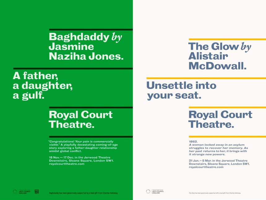
Located in London’s Sloane Square, The Royal Court Theatre has a reputation for premiering groundbreaking new plays by talented young dramatists — so much so that it’s known affectionately amongst theatre aficionados as ‘the writers’ theatre’. Just before the Covid pandemic, the playhouse tasked design agency Paul Belford Ltd with creating a series of posters to publicise each new season of their plays. The result? A set of eye-catching, copy-based promos, each featuring the title, the playwright’s name and a tagline, that bring to mind the bold midcentury work of designers like Reid Miles — modern, witty and sharp.
The striking work earned the team a Graphite Pencil for Writing for Design at the 2023 D&AD Awards. We caught up with Paul Belford, the lead designer on the project, and Dean Webb, who worked as the copywriter, to find out how they collaborated to create the award-winning posters, and how they overcame the various challenges that the word-led designs posed.

Work within constraints to inform design
As a nod to the Royal Court’s nickname of ‘the writers' theatre’, Belford decided that the design for the posters should be composed purely of words, so in many ways the design informed the copy. But this, especially for the longer-titled plays such as Ryan Calais Cameron’s For Black Boys Who Have Considered Suicide When The Hue Gets Too Heavy, presented its own challenge: how do you attract people to come and see the play in just a few words? “The shorter the line, the harder it is to get a meaning into it,” Webb says. “In this instance, I think the most amount of words we did for a tagline was eight — some of them are only two.” On top of this, the theatre was keen for each playwright’s name to have the same sized billing as the play title, which meant space on the posters was even more limited. “Like a lot of design, it’s about working within constraints and doing what you can,” Belford adds. The font, for instance, had to be the Royal Court’s typeface. There are no logos, so the name of the theatre had to be on each iteration, and the crucial information about each play’s running times, dates and location needed to be included, and legible. The solution from a design perspective was to offset the headline from the play title, and to keep the main information the same point size. “A series of considerations and constraints naturally led to that design,” explains Belford.
Play with words to distil their meaning
After a read-through of each play’s script, the pair picked out key themes or features from the content with which to work. Webb’s resulting copy is succinct and often plays on words, as is the case with This Is Not Who I Am by Dave Davidson (‘You won’t even see the beginning coming’) or Jasmine Naziha Jones’ Baghdaddy (‘A father, a daughter, a gulf’). They’re taglines that pique interest and draw you in, something which took on a deeper meaning for Webb, given the state of the arts after the pandemic: “When we started, because of Covid, I felt like we were doing theatre itself a service — not just the Royal Court — in trying to get people back in. The weight was a bit heavier then.”

Don’t get attached to your copy when writing for writers
One of the other challenges the team faced was that they were writing adverts for other writers’ work — a critical bunch. “Working on this project was similar to working with publishers, where the author has final sign-off on the creative work,” Belford explains. “They don’t always buy what we’d like them to buy.” When working on collaborative projects like this, it’s best to not get too attached to your work, as something you’re proud of might not always make it through the various stages of sign-off.
“Once you’ve done a well-designed poster with a brilliant line on it, you’re rolling the dice,” Belford continues. “Sometimes the playwright won’t like it, or will want to write their own. Sometimes the director might have a point of view; often marketing will have a point of view. It’s difficult to get these things through.” Naturally, there were several times when work that the team thought was great was rejected right out of hand. “This work has been through lots of hurdles. It’s kind of amazing that it’s relatively unscathed,” Belford says. “Some of the other ones we’ve worked on for other plays, we wouldn’t dream of entering into awards, because they’re too battered.”


