back to annual
YouTube Video

Empowering indigenous Australians and allies with a brand celebrating Blak excellence

From birth, the odds are stacked against Indigenous Australians, who don’t see Indigenous role models celebrated on a large scale. Rapper Nooky and R/GA Australia’s Ben Miles talk to us about their platform, We Are Warriors, and explain the organisation owned and run by Indigenous people fixing the imbalance in representation. By putting a spotlight on Blak excellence, We Are Warriors shows younger generations of Indigenous people that the sky's the limit.

Collaborating with allies, organisations, and the world’s biggest brands was key for the movement to reach people and shift the narrative. An important moment came with the launch of WAW’s Blak Powerhouse. The powerhouse opened its doors to over two thousand people on Australian Independence Day, bringing the WAW movement into people’s minds on a chequered day in the country’s history. The branding incorporates the Australian national flag with a bold, fearless colour palette to create visual appeal for young Indigenous kids who want to associate with a socially-conscious, bold design that is unashamedly itself.

Explore Branding

FCB Africa shares how it reached a youth audience with a whole new language and rebrand

FCB Africa shares how it reached a youth audience with a whole new language and rebrand

What makes a successful brand identity? In the case of South African design studio FCB Africa it all comes down to simplicity, modularity and cultural context. Such was the case for its rebrand for Digital Youth Academy ICT — a Johannasburg-based academy that aims to address the digital skills shortage through education for young people.

The success of the rebrand comes down to many factors, one of which is its ability to be applied across a multitude of mediums from tote bags and T-shirts to posters. The other is its unique visual language, which is inspired by the oldest computer language there is: the binary code. Using this as a springboard for the identity, the team merged 1s and 0s with geometric shapes inspired by step and repeat Litema patterns commonly associated with South African tribes — all in all building a unique identity to pique the interest of the next generation of digital minds.

The response has been momentous; not only has it received a Yellow Pencil in Graphic Design, but the refreshed identity has resulted in a 614% increase in sign ups to the academy. Here, we speak to Thabang Lehobye, Head of Design at FCB, to find out what constitutes a strong brand identity, why cultural context is paramount and how simplicity always comes out on top in a project of this kind.

DYICTA Logo Design across stationary and accessories.
DYICTA Logo Design, FCB Africa

Distil the brand’s ethos

The first place to start when tackling a brief like this is research. For FCB, this entailed looking at the courses the academy offers as well as its ethos — to address the skills shortage in South Africa and provide the younger generation with digital skills in education. “And from that, we narrowed it down to what is really fundamental to the academy,” explains Lehobye. “We knew we had to come up with a brand identity that not only speaks to what is at the core of the academy itself, but also entices the students into being inquisitive about the courses it’s offering.”

Find the essence

Design doesn’t have to be complicated. After spending months deciding on the concept, the FCB team decided to simplify and focus on “the most basic element of computing” — the binary code. “The brief was a huge task and we had to pick and choose the most fundamental thing that represents the academy,” says Lehobye.

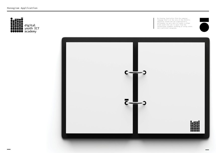
The team designed a simple and meticulous monogram that uses the 0s and 1s — the “ABCs of computing language” — as the base of the graphic system, which went on to inform the entire visual language of the identity. “Logos are like signage that directs you to the brand philosophies and all those things that the brand represents,” says Lehobye. “It also taught us that even the logo can be a visual identity system by itself. For us, it was one of those exercises that really tested us in terms of how simple we could make things.”

DYICTA Logo Design on notebook.
DYICTA Logo Design, FCB Africa

Work within the cultural context

Cultural context played an important role in the process for FCB. “How do we differentiate ourselves from institutions that are so influenced by Western ways of looking at things or traditions? A lot of institutions would lean more towards monograms,” explains Lehobye. Here, he’s referring to the institutions with “long names” like University of Johannesburg or University of Cape Town, who’ve then abbreviated their monograms to UJ or UCT. “We really wanted to differentiate from that,” he adds. “How do we take forward an institution that is at the cutting edge of technology in teaching children into the future?”

From there, the team steered away from what other institutions were doing and instead looked to local traditions, landing on the step-and-repeat Litema patterns found in South African tribes as a reference. These engravings are made with fingers on walls and were established before paint was introduced, meaning the most accessible pigment at the time was black and white. This informed the identity for FCB, and its use of monochrome and geometric shapes. “We felt that it was one of those distinctive, traditional aspects of where we are that we could borrow, and that everyone could relate to,” adds Lehobye.

Iterate the concept

Once the visual language was established, the team started to think about how the identity could be used across media — from the logo to printing the identity on a tote bag. “It’s important that brand identities are modular,” continues Lehobye. “It has to work.”

As the identity was created for a digital youth academy, the team pulled inspiration from the classroom. When stacked, the logo’s binary code not only references the academy’s initials (DYICTA), it also represents the way that students fill and empty a class. “It all started with flipping the logo,” explains Lehobye. “Each letter represents a set of binaries and they’ll be horizontal in form, but then when we flipped it, it almost looked like symbols that resemble students in a classroom or learning environment.”

Size and scale were also vital in determining the look and feel of the identity. “When you scale it down, interesting things happen — like when it’s the smallest size, it becomes one student instead of a classroom,” he explains. When it’s larger, more students flood into the classroom, just in time before the bell rings. “This speaks to the academy’s goal of making education more accessible to the greater population of young people.”

DYICTA Logo Design using binary code.
DYICTA Logo Design, FCB Africa

Experiment with logo application

Application was one of the key factors in determining the success of the project and for ultimately driving sign ups to the academy. FCB perceived the project as both a campaign and rebrand, with most of the placement — such as posters, billboards and T-shirts — taking place in Johannesburg, which is known for its vivid colour palettes and signage. This black-and-white, geometric identity stands out in stark comparison, meaning that people would stop and stare at the designs. “The set of 1s and 0s makes you want to take a second look and ask, what is that thing? It feels cryptic enough to make Gen Z want to take a picture in front of it,” says Lehobye. “It was treated more like graffiti.”

Thanks to the FCB team and people who were physically applying the brand identity on the walls and streets, the identity was a triumph; it was able to catch the attention of passersby — especially young people — and ultimately inspire them to sign up to the courses at the academy.

Explore Graphic Design

We have placed cookies on your computer to help make this website better.
You can change your cookie settings at any time. Otherwise, we'll assume you're OK to continue.