East London Liquor Company
Wood Pencil / Writing for Design / Brand Voice / 2021
Shortlist / Typography / Integrated
Shortlist / Packaging Design / Rebrand
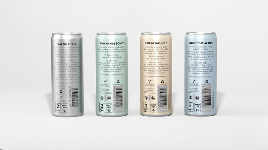
For ELLC, Ragged Edge stripped out the fuss and facade, and poured in two fingers of fighting spirit to create a brand that can transcend ‘craft’, take on the big players, reach more customers, and drive product expansion. The custom typeface is the centrepiece in this brutally simple identity. And comes complete with a found set of alternative characters – inspired by the distillery, the production process, its machinery, and the local area of East London.
-
Video Player is loading.
-
Video Player is loading.
-

-

-

-

-

-

-

-

-

-

-

-

-

-

-

-

-

-

-

-

-

-

-

-

-

-

-

-

-

-

-

-

-

-

-

-

-

-

-

-

-

-

-

-

-

-

-

-

-

-

-

-

-

-

-

-

-

-

-

-

-

-

-
