
Madoka Nishi
on typography and cultural inheritance
Madoka Nishi is the Editor-in-chief of IDEA, a quarterly magazine published in Tokyo, Japan that focuses on graphic design and typography. Her recent features include a piece on the current landscape of experimental type design and type foundries for an issue of the magazine.
Here, Nishi talks about the prominence of non-Latin typefaces at this year’s awards, and how they localise elements of Latin type to create unique styles. She also discusses how some of the shortlisted and winning typography can help us to understand and preserve diverse languages, scripts and cultures for future generations.
The Pencil-winning and shortlisted works in the Type Design and Typography categories of the 2021 D&AD Awards showed a variety of typefaces from non-Latin-based languages. Seeing the winning work selected by the judges was an opportunity for us designers and design researchers who do not speak Latin-derived languages to review our local work from an international perspective, and to think about the significance of typography in passing on culture through the written word.

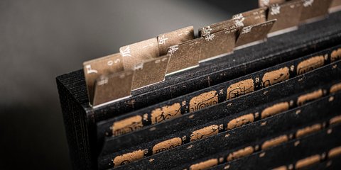
For a long time, the dominant force behind type design and typography has been the formative culture of the Latin-speaking world, as represented by Swiss typography. For this reason, many non-Latin-speaking designers working today have studied typography that originated in Western countries and developed their own designs in their own languages inspired by that system. The Japanese writing system, for example, consists of two types of characters: the syllabic kana – hiragana (平仮名) and katakana (片仮名) – and kanji (漢字), the adopted Chinese characters. Each has different usages, purposes and characteristics and all are necessary in Japanese writing.
“For a long time, the dominant force behind type design and typography has been the formative culture of the Latin-speaking world”
When we Japanese combine different writing forms such as Kanji, Katakana, and Hiragana in a single language, we have taken care not to destroy the beauty of Latin typography by supplementing the parts not covered by the Latin typographic grammar with our own rules. However, such methods do not necessarily respect the unique character and culture of the Japanese language as it superficially transplants the style of Latin typography. In other words, types were previously unable to achieve localisation by integrating the essence of Latin typography with Japanese writing culture. Similarly, countries in Asia, Africa, and the Middle East, which have their own writing cultures, have long faced the challenge of localising Latin typography.


Noto Traditional Nushu
see projectThe development of multilingual fonts by font vendors in various countries (such as Noto Traditional Nushu for Google by Liu Zhao Studio) – along with the spread of font design tools that have emerged to support individual creators – has marked a turning point in this situation. FutureFonts, for example, makes it possible to sell typefaces in progress, which allows individual designers to earn money for their development. In the wake of globalisation, it has become common for non-Latin-speaking countries to write both their native language and English, but before this, they usually used their native language fonts that did not interfere with the design of existing European typefaces.
However, with the collaboration of font vendors in various countries, the development of multilingual fonts – where fonts for each language are designed based on a single European typeface – has become a norm, and fonts that fit in with the writing culture of each country have become popular. In addition, around 2010, font design applications that can be used on a personal level became widespread, and font designers in non-Latin-speaking countries began to design European fonts that are suitable for use with their native languages, encouraging more appropriate localisation of Latin typography.
“it reminds us that letters are not just symbols for communicating information but are deeply rooted in the traditional culture of a country or region”

Coca-Cola Care Font
see projectLooking at this year's award-winning works in this context, I’d like to first consider Coca-Cola Care Font from Coca-Cola China, CoolCharacter and FounderType. The font was created by the brand for the Chinese market and won a Wood Pencil. It was custom-made to pay tribute to the resonance between the corporation's values and the gentle, unassuming "we care" attitude advocated in Chinese culture. A symbolic example of the localisation of Latin typography, it is meaningful that a global company like Coca-Cola has now developed a new typeface specifically for the Asian market. More than that, it reminds us that letters are not just symbols for communicating information but are deeply rooted in the traditional culture of a country or region. It was also a good example of the designers' respect for the Chinese character culture and their attitude toward the coexistence of Latin-speaking and non-Latin-speaking cultures.

Next, we’ll consider Illuminating the Indigenous Soul, which was amongst the year’s shortlisted work. Light Publicity and Drill came up with a custom font for The Foundation for Ainu Culture, in an attempt to visualise the Ainu language of the Hokkaido region of Japan, which has been passed down orally rather than in writing. The goal was to transform long-standing prejudices into admiration and respect by using sounds and motifs from Ainu culture. This is another example of how identity and culture can be expressed through localised typography.
There were also some notable examples of visual communication that focused on a very small, localised writing culture from a global perspective, such as Noto Traditional Nushu, designed by Liu Zhao Studio for Google. The font is based on the secret female-only script, Nüshu, that was first used in the beginning of the Song dynasty in the remotest parts of southern China. It was a means for women in that remote provincial area to share thoughts and feelings between close friends, emerging from a long oral tradition of women's storytelling. Nüshu was declared extinct when its last known user died. It’s now being revived by the efforts of the Chinese government. With this work, the D&AD Awards may be the first time that a culture that has not been recognised by the international community comes to light.

This year, D&AD judges also celebrated typefaces that draw inspiration from historic languages. One of the entries, the shortlisted Lyon Arabic, states that it is an addition to Arabic typography, based on Naskh and Nastaliq, which are styles of Islamic calligraphy. By shedding light on a language like Nüshu, or incorporating age-old scripts into modern types, these works show us how typography can help us to understand and preserve diverse languages, scripts and cultures for future generations.
Living in a pluralistic society, designers in the future will be required to play an increasingly important role in understanding diverse interpretations and values and to think of ways to translate them visually. I look forward to the future of the D&AD Awards as a place to evaluate unique but valuable work.
More stories
MagCulture’s Jeremy Leslie
on print as a document of time
 read feature
How Yin Linlin drew on ancient paper-crafting techniques to create a book with dual meaning
 read interview
When immersive storytelling elevates writing for design
 read interview


